The Objective: To distinguish the Coveo Blog as an accessible,
visually dynamic extension of the brand by leaning into a
more expressive and “artsy” creative direction.
Unlike the primary brand’s structured sophistication,
the blog’s goal is to simplify complex topics.
visually dynamic extension of the brand by leaning into a
more expressive and “artsy” creative direction.
Unlike the primary brand’s structured sophistication,
the blog’s goal is to simplify complex topics.

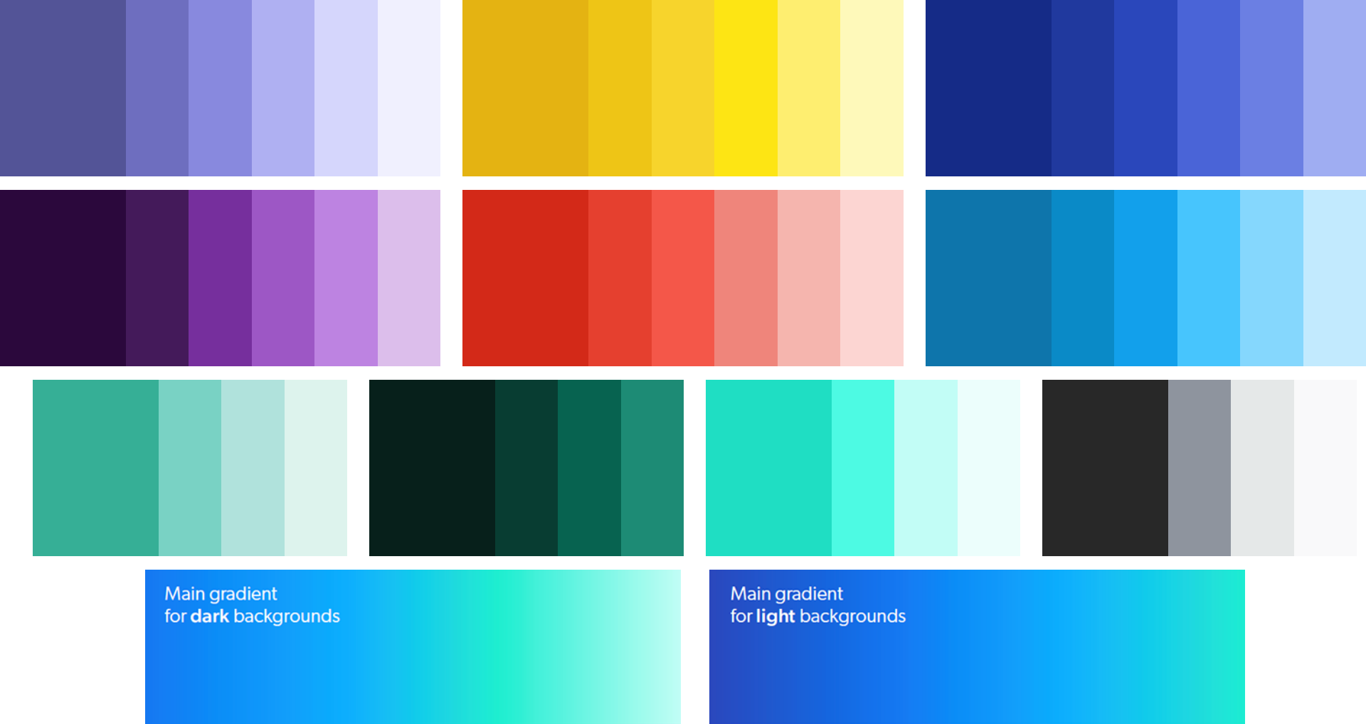
Focus: Leverage the full brand palette and tonal shading to add depth
to a minimalist, bold illustration style.
Outcome: A vibrant yet clean visual identity that uses strategic color to make
complex content feel approachable.
to a minimalist, bold illustration style.
Outcome: A vibrant yet clean visual identity that uses strategic color to make
complex content feel approachable.

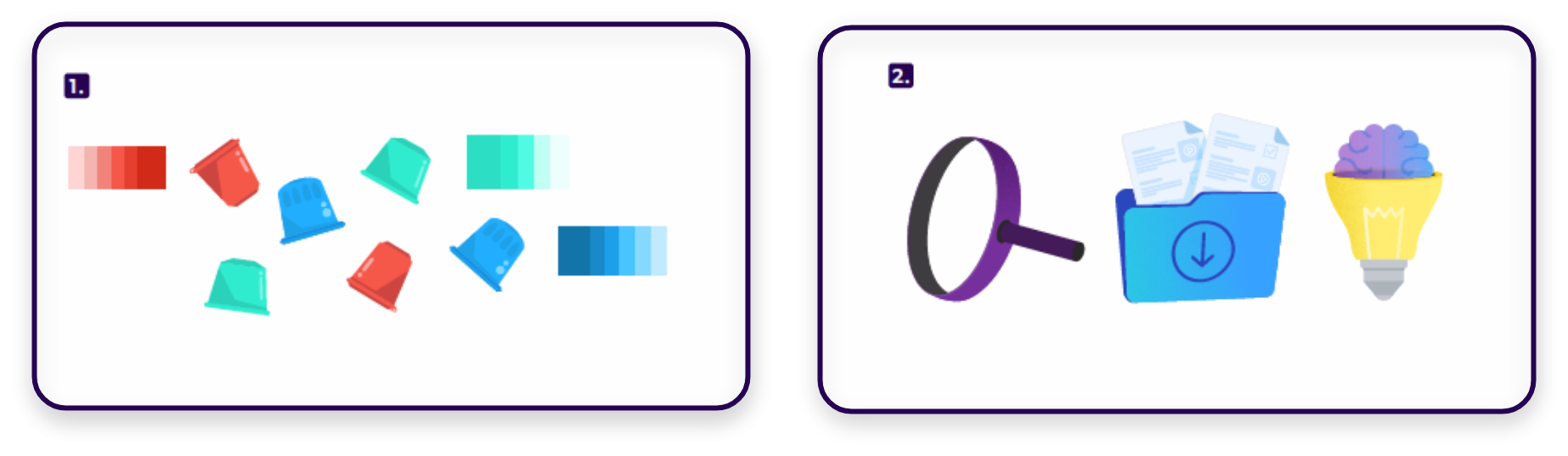
Focus: Customize minimal, flat illustrations with brand-aligned
color palettes and subtle texture.
Outcome: A cohesive, high-end visual identity that transforms
any source into a bespoke brand asset.
color palettes and subtle texture.
Outcome: A cohesive, high-end visual identity that transforms
any source into a bespoke brand asset.

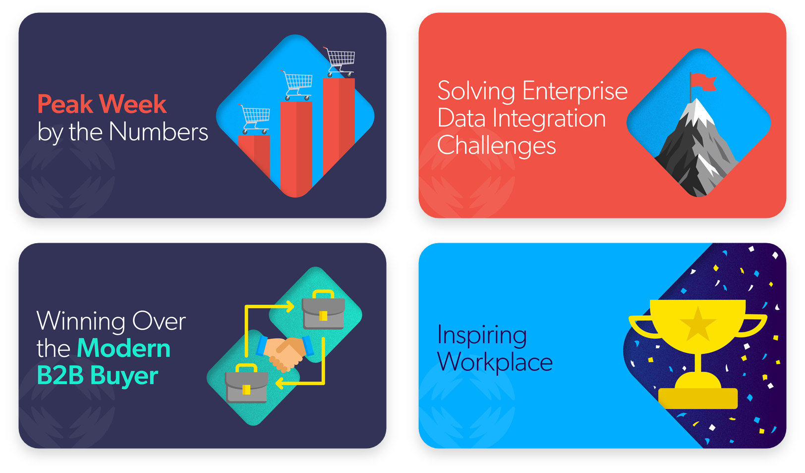
Focus: Combine flat, minimal illustrations with a signature “die-cut”
diamond template to create layered, dynamic compositions.
Outcome: A cohesive header system where elements bleed across boundaries,
transforming standard assets into unique, brand-specific focal points.
diamond template to create layered, dynamic compositions.
Outcome: A cohesive header system where elements bleed across boundaries,
transforming standard assets into unique, brand-specific focal points.